IHSC is constituted as an institutional network of health systems researchers responding to policy questions that are critical to India’s health systems reforms. Designed to achieve policy impact, IHSC adopts a truly collaborative approach between research and policy making, while maintaining transparency as its core value. Research topics are chosen through a joint consensus between researchers and policymakers. The India Health Systems Collaborative(IHSC) is one of a growing network of health systems researchers in India and the rest of the world. It is a combined ecosystem of researchers that work in collaboration with the government. IHSC mainly focuses on generating and using scientific evidence towards strengthening the Indian health system. They have members across the country in the form of most premier educational institutes who are working on Health Systems research.
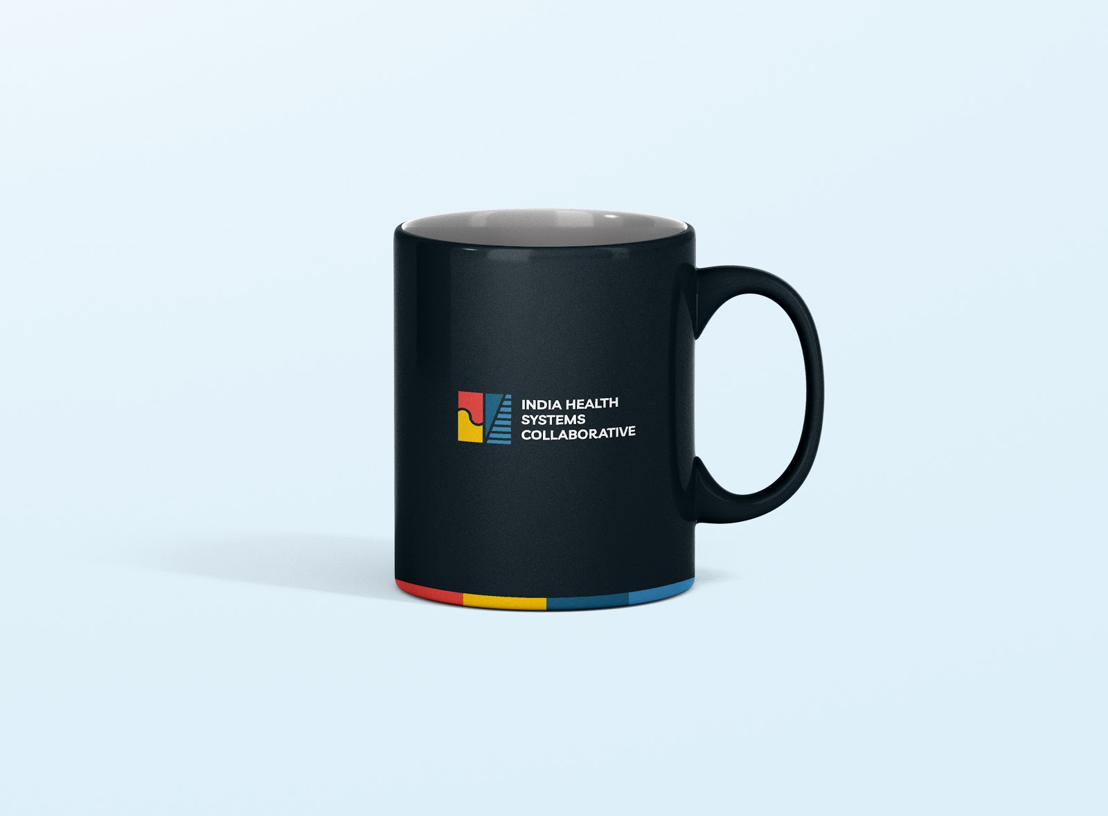
The logo comprises of two elements combined to form the whole idea of the consortium.
The left section of the logo represents partnership and community building denoting support and assistance.
While the other section represents growth denoted by the stairs.
The colours used are judiciously chosen based on the qualities they depict. Colours like red and yellow denotes
energy and warmth while blue is synonymous with trust and sincerity.
EXECUTION:
BROCHURE & WEBSITE:
For the branding of this new project, we sticked to the central idea of ‘Utopia’ that was about being ideal and perfect. After researching on the Utopian philosophies and art, we came across a symbolic representation that occurred almost everywhere. The element that appeared in almost all the places was a 'sphere with a void', that signifies ' a portal' and 'a shelter'. We incorporated this element in our branding and initial communication too.
We extended the brand language in the brochure and website. The tonality and colours that were used lent the premium luxury feel to it. We further added the element of portal in the images, to create a recall value.